Menu
Olympic View Logo

Olympic View Church

As the designer for this rebrand, I guided a transformation from a cliché heavy logo, to a welcoming, modern brand that speaks to families, students, and the surrounding community.

Discovery, Strategy, and Planning

I met with church leadership and quickly found that the current logo of the church lacked purpose. The design featured visual tropes of every church and no purpose behind the marks. This resulted in limited relevance for growing families looking for a community to call home. Branding momentum was non-existent in the surrounding community.

What this church needs is more than a redesign.

We need a clear brand message.

We need cohesive visuals that make potential church attendees feel the love that is inside this building!

We need strategy behind all of it.

I met with leadership and staff to help research what matters to them and their community.
They want to be a "No Matter Church." No matter who you are or where you have been, you have a seat here.
They wanted to be "relevant" with modern visuals, while allowing the brand to also speak to demographics outside of young families.

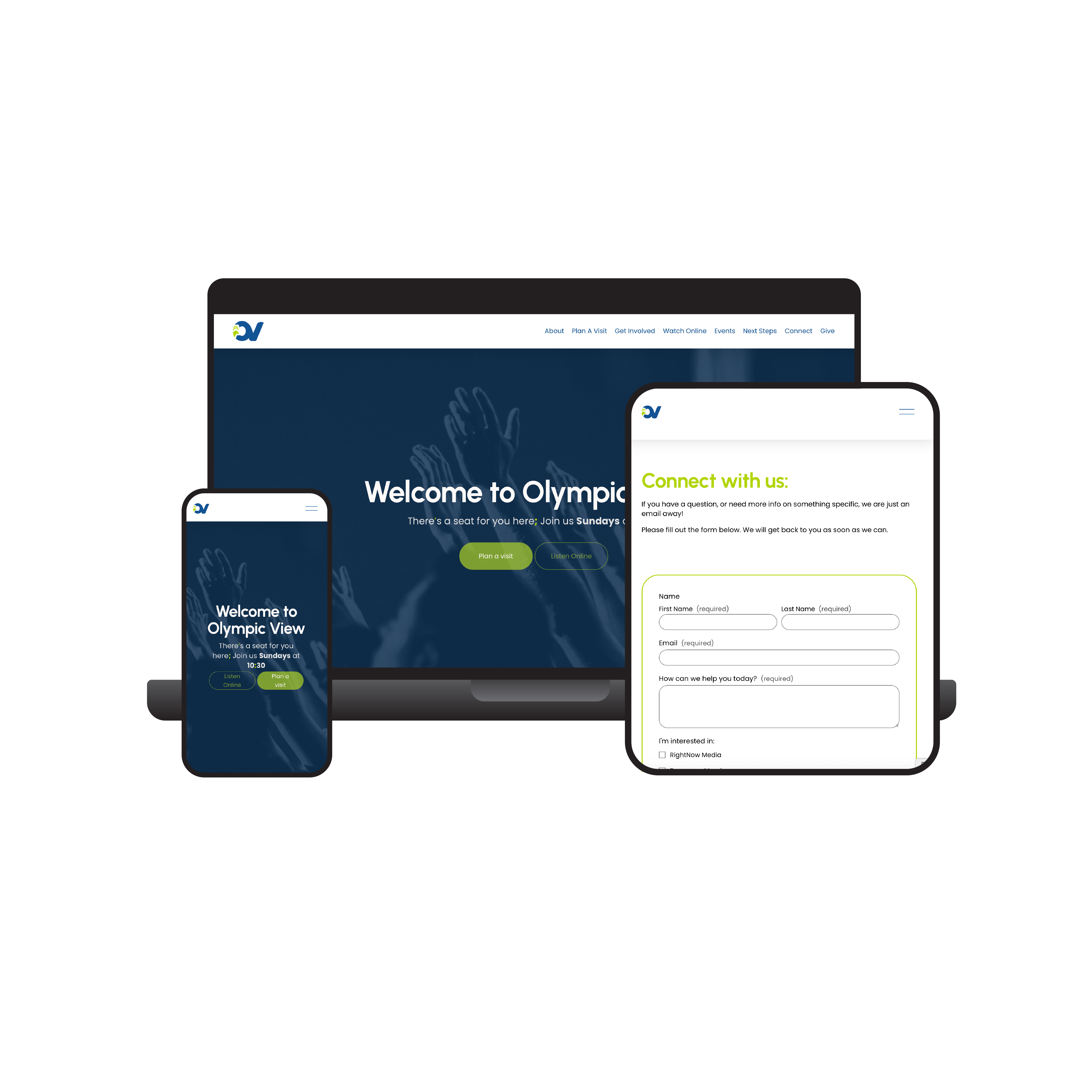
After branding is complete, I need to help them build a website that ignites curiosity, urging people to not just attend church, but to get involved and enjoy community.

Ovc1
Ovc2
Ovc3
Ovc4
Ovc5
Ovc6

What this new brand has resulted in:

Increased social media traffic.
Increased camaraderie inside the church.
Clear messaging for event marketing, ads, marketing collateral, and environmental strategy with signage and building decor.
Energy behind conversations amongst the congregation and their communities.

Olympic View Logo
Previous: Oakridge Real Estate Other Work