
CCOH is a non-denominational church in the midwest. When I met them, they had a logo but no brand. Nobody was able to tell me what the logo meant to the church or why they used it. A board member thinks this was found on Google.
Through the process of getting to know the church culture, vision, and their challenges, I am thrilled to be able to take this inward passion and desire to bring more people through their church doors, and display it through a polished, friendly, and modern brand identity.

Old Logo
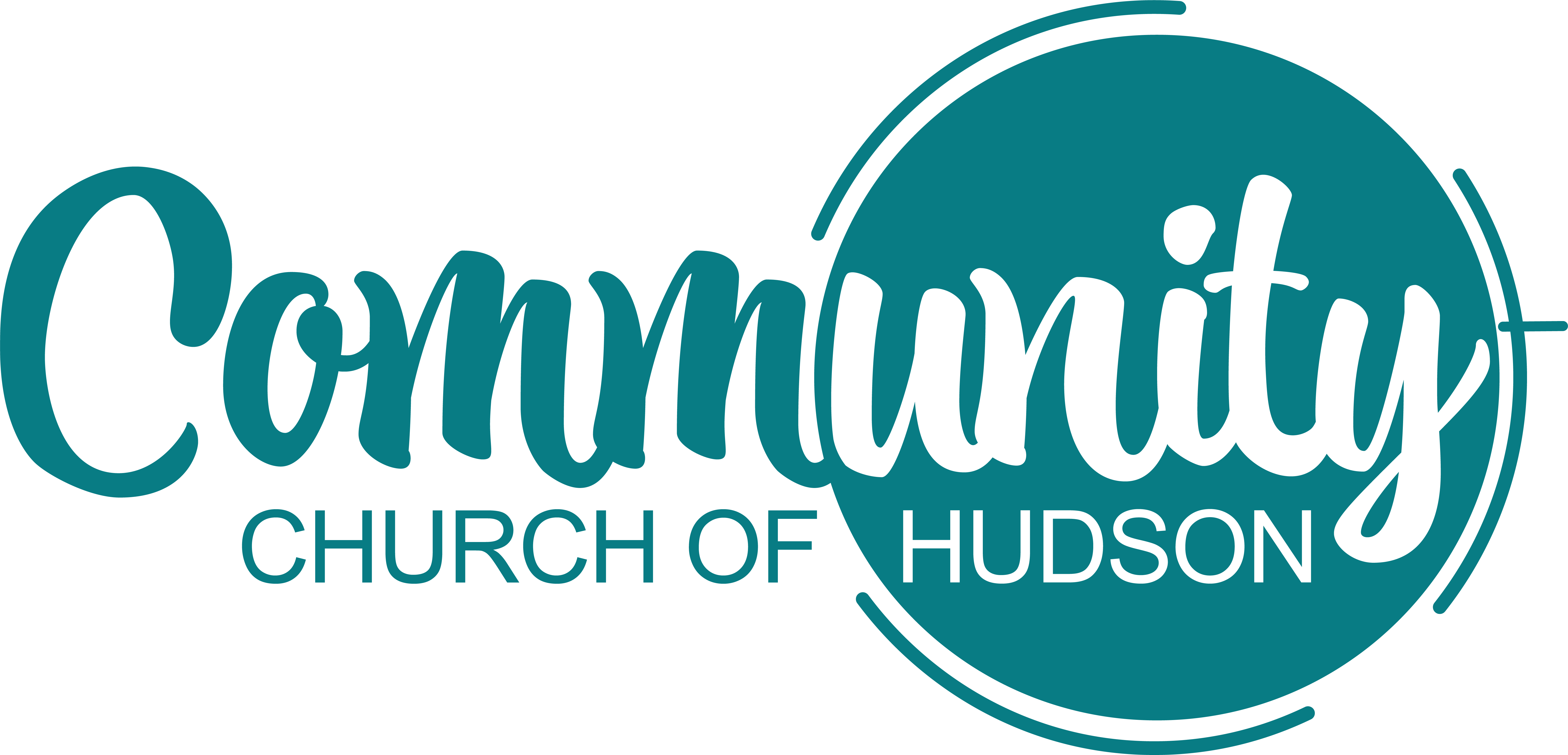
New Logo
The brand tone of voice they aspired to have: friendly, nurturing, welcoming, and modern.
Their perceived image from the community around them? Country Club.
What message did they want to communicate? "Everyone is welcome here. There's a seat at our table for you."
The color that immediately spoke to me was teal. The psychology of color is powerful, everyone! Teal is a mix of blue and green, and combines the stability of blue with the revitalizing energy of green. Teal is less common than both blue and green, giving this brand color option originality.
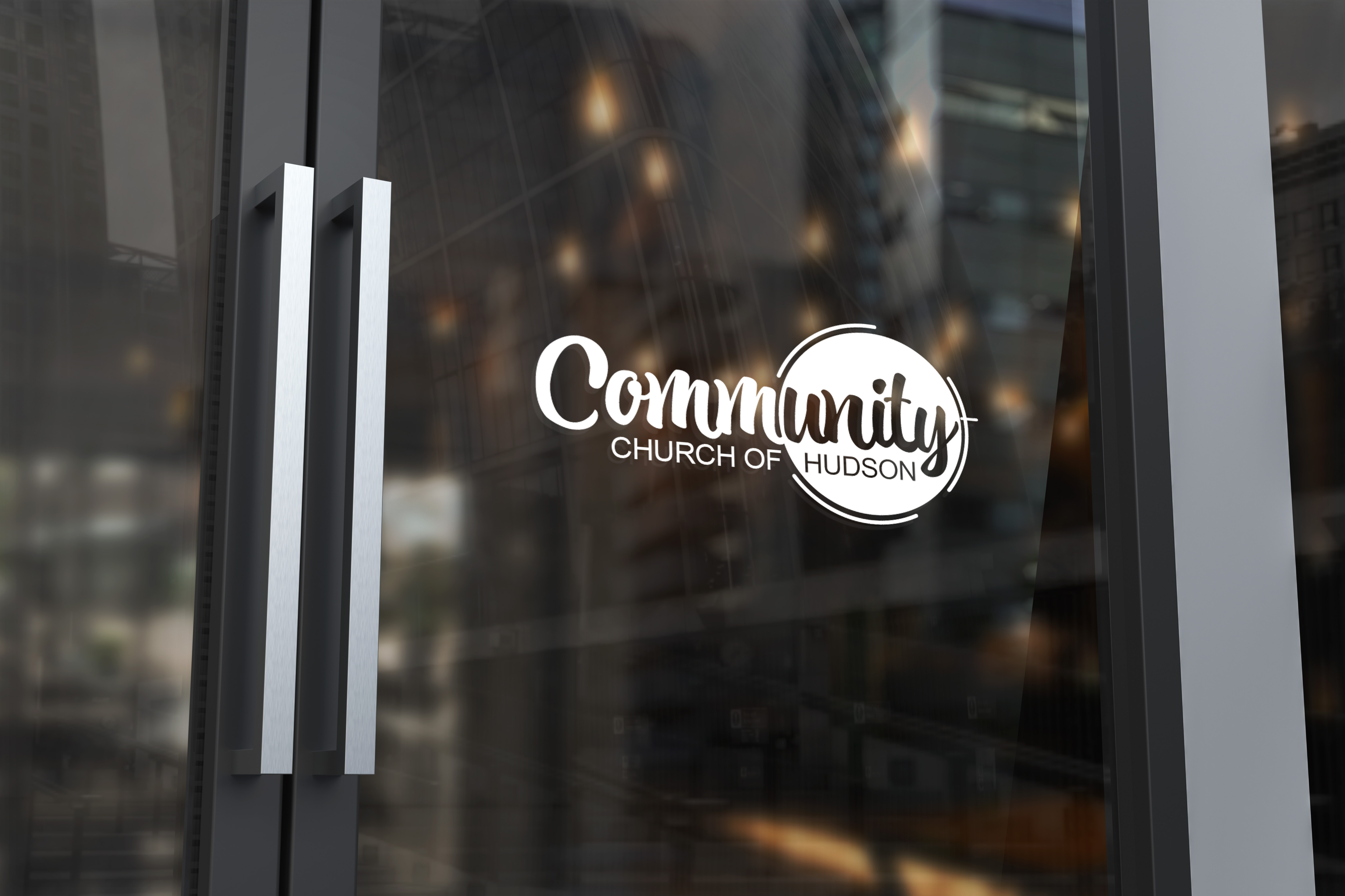
The cirle around the word "unity" is intentional, with the lines surrounding the circle creating a subtle cross and symbolizing a camera lens, focusing on the word, "unity."
Community is in this curvy, playful script font, Atocha. It's to include a fun, friendly feel to the logo. A clean sans serif font was chosen for "Church of Hudson" to balance the heavier, decorative text above.
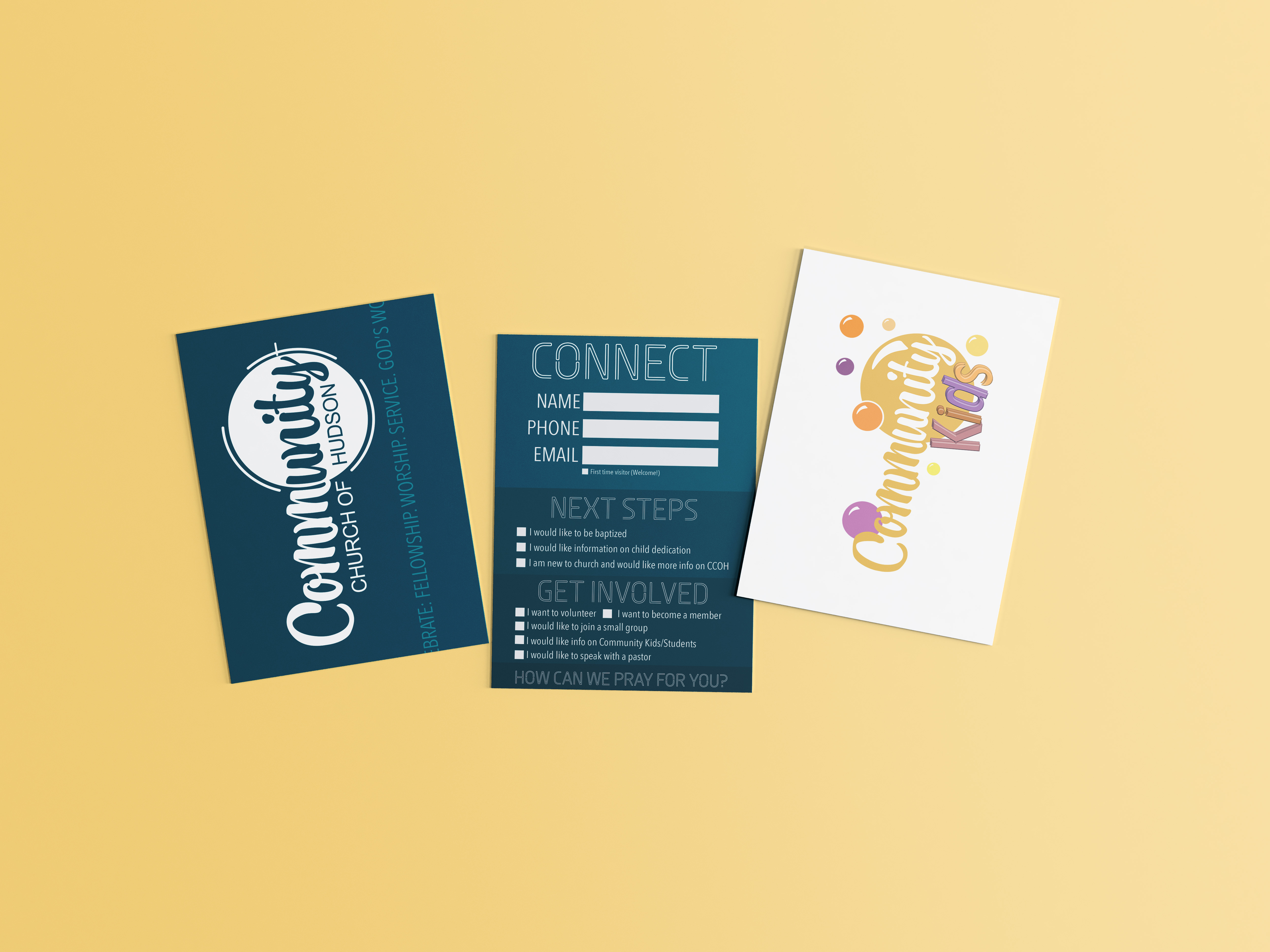
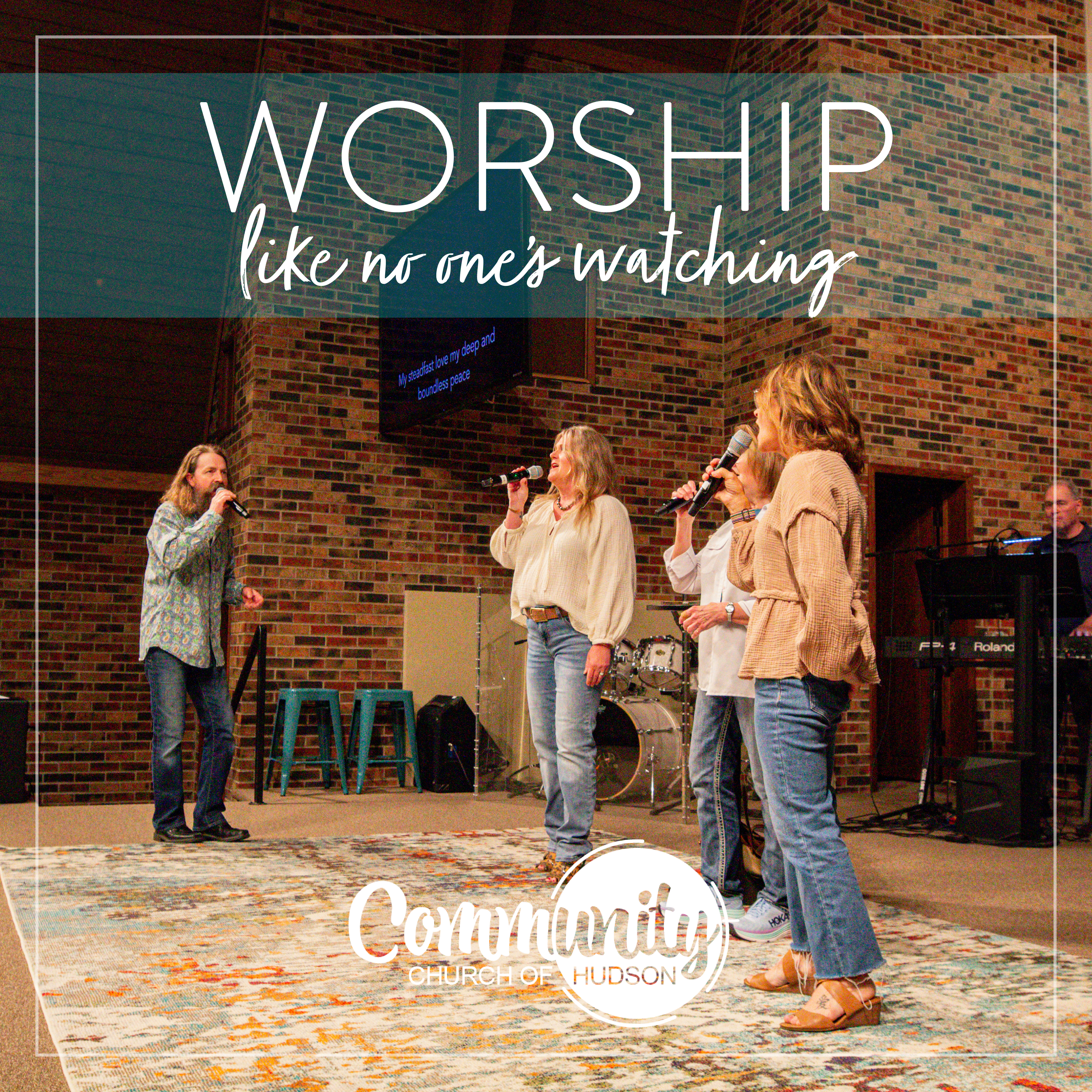
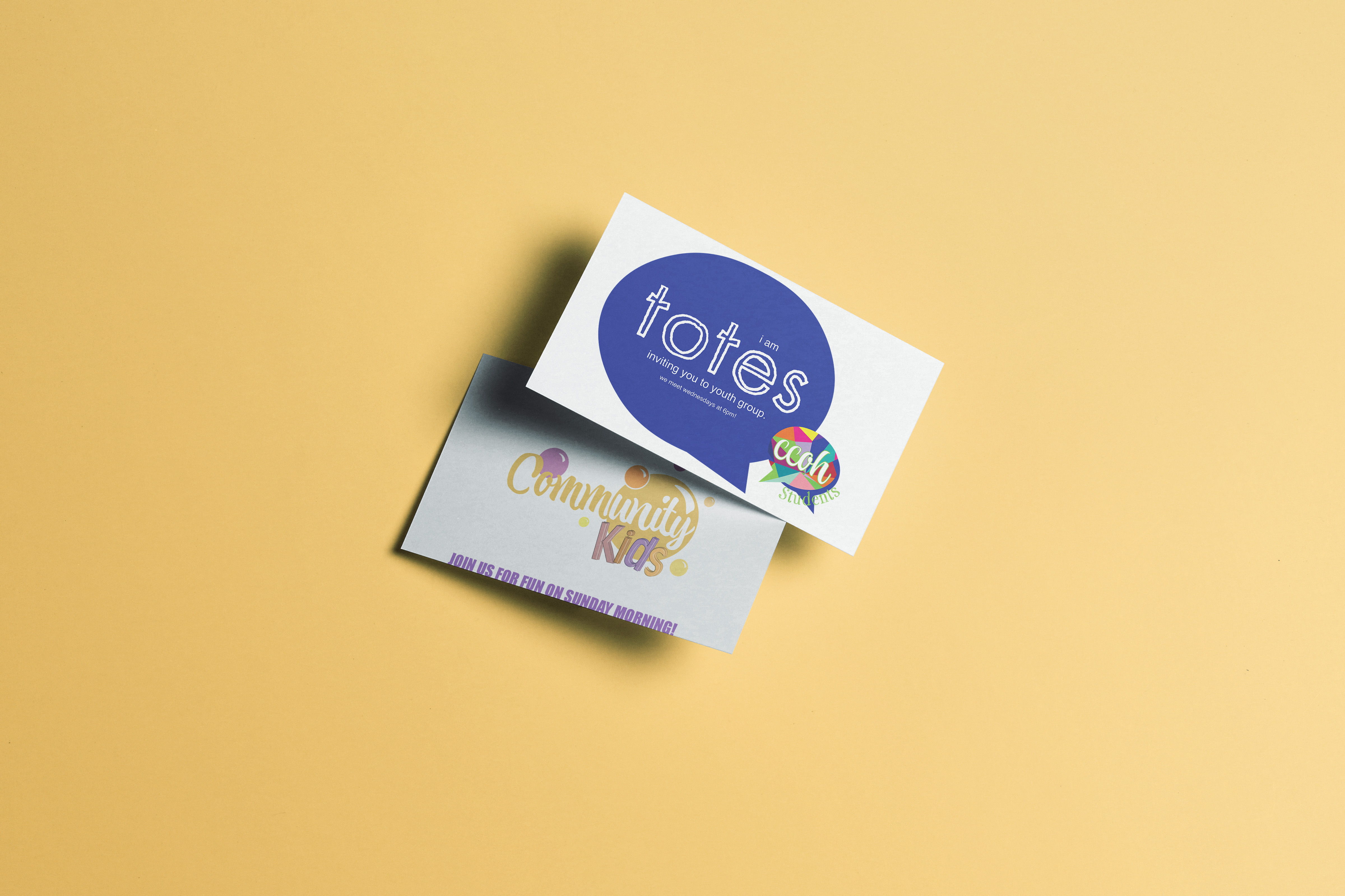
CCOH needed branding for their two other ministries. This wasn't just so all the ministries would look cohesive, but it was to show visitors that thought was put into the indentity of each group.
Community Students was branded to be focused on conversation, and the colorful blocks inside the conversation bubble not only reflect the style of some of their older, stained glass windows, but the idea that all types of people exist, and they're safe in this space.
Community Kids was branded to be fun, light, and full of energy. The color palette alone makes you feel energized. The bubbles are just for fun, and tie in well with all of the outdoor events planned throughout the year.